####
Achtung: it seems Comments were disabled on this and another post recently. This was not intentional. I will try to be more diligent in making sure that visitors can respond (when Blogger will allow).
####
One thing I wanted to mention, way back when I was in Steppenwolf mode (see here), was that book covers have come a long way since I was a kid.
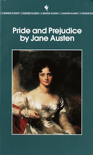
Let me put it this way, if you have a faint interest in reading, let’s say, Pride and Prejudice (figuring that you hadn’t seen any of the filmed adaptations, but simply heard good things), what would go through your head when you saw this:
Let me guess: the most boring book in the world? Tedium personified? 300 pages about drollness?
Of course that’s not true. Most people who’ve read P&P consider it a classic. People get into arguments about its film/TV adaptations, which is a good sign that the book rules over them all. But the cover! The cover stinks! Let’s face it, this is not a cover intended to sell a book, it’s a cover intended to put you to sleep (unless you are a Victorian fetishist).
Now, you say, look here chap – don’t you know you shouldn’t judge a book by its cover? Yes. I agree. But why bother having an illustration on the cover, or some semblance of design if it does nothing for what it represents? The only reason Jane Austen allows that cover on her book is that she’s dead and there’s nothing she can do about it.
Quite frankly, I prefer this as an alternative, if I had the choice:
If I wanted to read P&P, the above cover wouldn’t stop me from doing so. I’d be forced to read it in order to find out if I liked it or not, without the mediation of what is often for “classic literature” terrible book design.
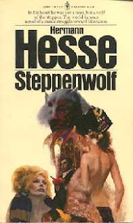
This is why Steppenwolf figures into this story. Check out the cover that I grew up looking at:

While yes, technically it incorporates many of the elements of the book, it’s such a literal and terribly dated approach, it’s always turned me off. It’s a James Bond poster by way of Aldous Huxley. *Blech* – no thank you.
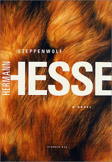
Now, when I finally picked up a copy last year, this is what I saw on the shelf:
It’s a book! It’s a book! Not a movie, not an illustrated story, but a book, with an author! I like this approach because it’s direct yet cryptic at the same time – it’s telling me nothing about the novel, yet ties in the title of the book with a visual artifact. That’s it. Nothing more. Aside from the synopsis on the back cover, you’re on your own.
To me – and I should tread carefully here because my wife happens to design books – this is what book design is about. Forget about “don’t judge a book by its cover” – that’s a nice aphorism as it applies to people, but to books – considering there are so many vying for our attention, the covers should support the material they…um…cover.
If you’ve got a moment, check out this f-a-n-t-a-s-t-i-c site which shows all of the major cover designs of HG Wells’ The War of the Worlds. That is, from 1898 to the present, from different countries and featuring a vast array of designs and interpretations. It gives you a fascinating look at how book design has evolved over the decades.


